GDP numbers in poor countries are usually fake
We need to be much more skeptical of official-seeming economic statistics

Is it possible for an economy to double overnight?
In the spring of 2014, that was the question that economists had to ask themselves. That’s because they were presented with a startling piece of news: the Nigerian government announced that its 2013 estimate for economic output was being revised upward by 89 percent. In that year, the Nigerian economy produced not 42.4 trillion naira, as previously thought, but actually 80.2 trillion. And so overnight, Nigeria leapfrogged South Africa and became the largest economy in all of Africa.
So what happened? Did the Nigerians discover a massive oil field in some hitherto unknown part of the Niger Delta? Did Lagos become the financial hub of Africa? Did Nigeria finally discover China’s secret recipe for industrialization?
No. None of that had happened. The Nigerian economy hadn’t changed at all. All that had changed was how the Nigerian government measured its economy.
The story was this: for years, Nigeria had been calculating its GDP, its gross domestic product, with economic weights from 1990—the “base year” when it had last surveyed economic activity in the country in any kind of rigorous way. So when they calculated GDP, they weighted contributions from sectors by how big they’d been in 1990, with some mild assumptions about growth since then. And so entire industries that had barely existed in 1990—like telecoms or movie production—were basically invisible in the national accounts. So when the government reset things to 2010, huge sectors appeared out of thin air. And you could see this in Nigeria’s economic growth numbers when they revised them way up.
This was great news for Nigeria. It meant that economic growth had been much stronger than previously estimated. And the statistics were better than they’d been before. More businesses were being surveyed, and there were new sources to cross-check growth figures.
But the update also raised an uncomfortable question. If a methodological improvement could have such a massive impact on the result—almost doubling GDP overnight and adding hundreds of billions of dollars in apparent value—then how good are these numbers anyway?
It would be one thing if this were just Nigeria, because Nigeria—as we’ve discussed before—tends to have really bad statistics on all sorts of things. But across poor countries, we find that huge changes in GDP numbers happen all the time. In 2010, Ghana had updated its base year and discovered that its economy was 60 percent larger than previously thought. So Ghana was instantly reclassified from a “low-income” economy to a “lower-middle income” one. The Guardian praised this as Ghana “escaping the poverty trap.” But literally nothing had changed other than a few spreadsheets. Todd Moss of the Center for Global Development was more circumspect: “Boy,” he wrote, “we really don’t know anything.”
And here’s the thing. Ghana and Nigeria are the good ones. They’re the countries that are managing to keep their economic statistics reasonably current. In most poor countries, we find something much worse. The GDP figures that get published for poor countries, either by the countries themselves or by international organizations on their behalf, typically amount to little more than loose guesses. In the better cases, they’re vague inferences based on crop forecasts, cement production, or small surveys. And in the worse cases, they’re literally just guesses made by the IMF or the World Bank, based on the average growth rates in nearby countries.
But however we reach those numbers, the result is essentially the same. Every year, we publish reams of apparently precise statistics about economic growth in poor countries. And a huge portion of those statistics are basically fake.
How in the world did we get here?

Poor countries are really bad at measuring GDP
Thirteen years ago, an economist named Morten Jerven published a book called Poor Numbers: How We Are Misled by African Development Statistics and What to Do About It. In that book, Jerven makes one simple, central argument: statistics in poor countries are really, really bad. He focuses on Africa, because he’s an Africa specialist, but the points he makes can be applied to other parts of the poor world. Poor countries have informal economies where little is recorded, and they have weak states that aren’t able to collect accurate statistics. The end result is that the economic statistics that they produce are frequently just fictitious: they are, Jerven says, “unreliable and potentially seriously misleading.”
Why is that?
GDP is the number that we use to assess the size of a country’s economy. This is, if you think about it, a difficult thing to do, because “the economy” is an abstraction: the economy is not a stock but a flow. It is not a single discrete thing but a huge collection of events, each associated with a net economic value. The rusting of a machine in a factory counts against GDP; the purchase of a sandwich counts towards it; and then there are a huge class of events that might produce value of some kind, but which aren’t counted in GDP at all.
And so to measure GDP, you need to get an understanding of a huge number of events that take place across a big population. In the United States or Europe, you can do this pretty easily via tax filings: people have to pay taxes, and the things they report give you a good snapshot of economic life.
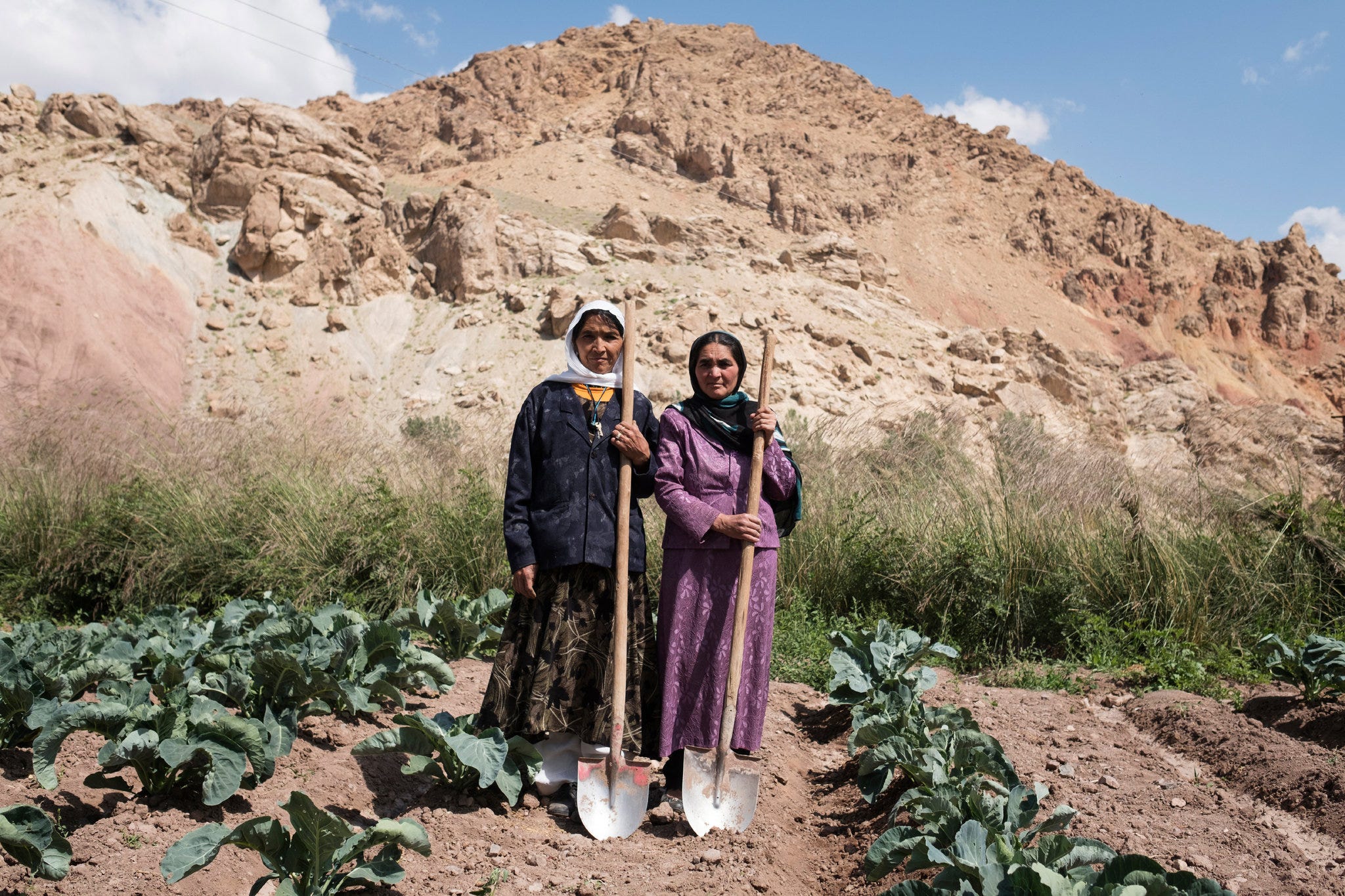
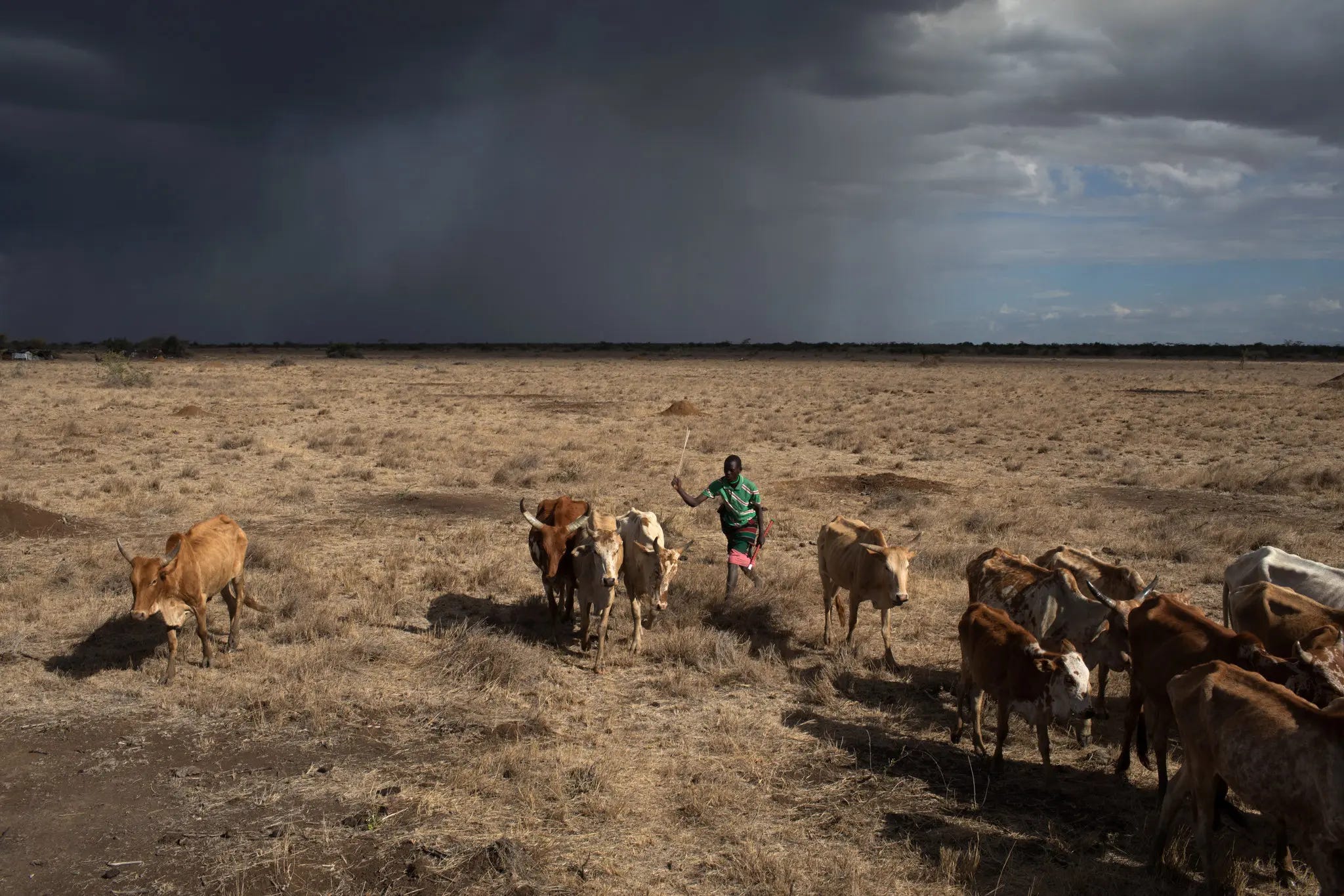
But that’s not the case in countries like Kenya or Nigeria. These countries have economies, of course, but their economies are overwhelmingly informal. Most people who work are employed in subsistence farming, which is to say they grow produce and sell whatever portion they don’t eat. None of what they do is written down. And then a substantial minority work in the informal “services” sector, “services” being a nice euphemism for peddling goods on the street or being a day laborer. (In practice, this typically just means “extremely underemployed.”) In almost every African country, only a single-digit percentage of the population has formal employment of any kind. And so only a tiny percentage of people report their income to the government.
That makes collecting economic data really hard. And it means that African countries have to figure out GDP numbers in, well, creative ways.
The best-practices way to calculate GDP, the one that the United Nations recommends, is to calculate GDP in three different ways: the income approach (adding up profits, wages, and rents), the expenditure approach (adding up consumption, investment, and government spending), and the production approach (adding up the value produced in each sector). In theory, all of these three different approaches should produce the same number, and in practice you’re supposed to calculate all three and reconcile any differences that emerge. And through that, you arrive at the GDP number. That’s what happens in the United States or Europe.
But let’s say you’re a statistician in an African country. You don’t have good data on profits or wages, because nobody pays taxes. And you don’t have good data on consumption or investment—again, because nobody pays taxes. So neither the income nor the expenditure approach is an option for you. You have to rely on the production approach: you go sector by sector and determine how much value each sector has generated in the last year.
That’s already a significant departure from how you’re supposed to calculate GDP. But you want to make the best of it. And to do that, you’ll need two things. You need to know the relative size of each sector, and you need to get a good sense of how much that sector grew. Once you have your sector weights, all you need to do is figure out how much each sector grew, and then you have your GDP growth rate.
So how do you get those sector weights? That’s where the base year comes in. At some point in the recent past, your government will have done a survey that determined the size of different sectors of the economy. Maybe it decided that mining was 60 percent of the economy and services were 40 percent of the economy. And maybe since then the sectors have shifted, so that mining is 55 percent and services are 45 percent. So those are your sector weights.
But wait, you might say. Don’t those sector weights seem to be really load-bearing? How do we know that they’re accurate? If one sector is underweighted and another is overweighted, wouldn’t that give us a totally inaccurate sense of what’s going on inside my economy?
And the answer is, well, yes. Sector weights are extremely important: so important, in fact, that base years are basically the crucial variable for GDP calculations in poor countries. Outdated base years overweight trends in old sectors while ignoring new ones; and when base years are updated, the changes can be massive. That’s why Nigeria and Ghana had such big upward revisions in their GDP numbers when they updated their base years. And in fact that type of thing happens all the time. Togo’s official GDP increased by 36 percent overnight after it updated its base year; Tanzania’s by 32 percent; Kenya’s by 25 percent.
And so the best-practices recommendation is this: if you’re going to rely on the production method to calculate GDP, then you should at least update your GDP base every ten years. But updating your base year is difficult, and a lot of countries don’t bother. Sudan’s base year for its GDP numbers, for example, is 1981. So the economic statistics that Sudan’s government produces reflect sectoral compositions from almost 50 years ago.
But outdated base years are just where the problems start. Because once you’ve settled on your sector weights—however accurate or inaccurate they might be—how do you figure out the rate of growth in each sector?
In rich countries, tax returns are again your friend. But you don’t have that resource in poor countries. So you have to figure out some other way to get sector production figures. And the way you do that is basically by guessing.
“Guessing” isn’t quite the official term for it, of course, though it sort of used to be. (Zambia’s national accounts for 1978, Jerven writes, “differentiated between two types of guesses: one asterisk indicated a ‘guestimate’ and two asterisks meant a ‘guestimate with a weak basis.’”) Your government isn’t able to collect information on most of what’s happening in the economy. So you use what little information you do have to grope toward the information that you don’t have.
And you do all this with shockingly few resources at your disposal. Here’s Jerven describing a visit to Zambia’s national bureau of statistics in the 2000s:
I was struck by the derelict state of the Central Statistical Office in Lusaka. The planned agricultural crop survey was being delayed by the need for car repairs, most of the offices were dark, and the computers were either missing or very old. The national accounts division had three employees, of whom only one was regularly in the office while I was visiting. No one at the office could account for how the income estimates had been made more than a decade ago. In the library there was a dearth of publications and no record of any activity that may or may not have taken place in the late 1970s, the 1980s, and the early 1990s. …
I was surprised by the lack of basic data and the rudimentary methods in use. Regular and reliable data were available only on government finances and the copper sector. The entire agricultural sector was accounted for by observing trends in crop forecasts for eight agricultural commodities. For the rest of the economy there really was no usable data. The construction sector was assumed to grow at the same rate as cement production and imports. Retail, wholesale, and transport sectors were all assumed to grow at the same rate as agricultural and copper production, while business services were assumed to grow at the same rate as trade and transport.
Three years later, Jerven returned to Lusaka to visit the statistical bureau once again. He discovered that things had only gotten worse: all of the country’s economic numbers were being prepared by one person. “What happens,” that lonely statistician asked Jerven, “if I disappear?”
So poor country GDP numbers are extremely inaccurate
So understaffed, poorly-funded departments—sometimes consisting of a single person—try to determine GDP numbers. They do this using only a single method, using sector weights that are typically outdated and sometimes outdated by decades, and in order to ascertain the growth rates in these sectors they use loose proxies like crop forecasts or cement production. How can the final product of this process be trustworthy?
The answer is that it’s typically not. The numbers that poor countries send into multilateral institutions like the World Bank or the IMF are extremely low-quality. A lot of the time they’re just too low-quality to publish. And sometimes they don’t send in anything at all.
But the World Bank and institutions like it can’t simply stop publishing GDP data. So when there’s a data gap, the World Bank simply makes guesses. For countries like Eritrea, which doesn’t release regular or transparent national accounts, the IMF and World Bank rely on staff estimates, often based on historical trends from the 1990s or 2000s. For other countries that don’t send in usable numbers, they just infer that the country grew at the same rate as its neighbors or other countries at that income level. Jerven writes:
Alwyn Young discovered the problem of absent data and unclear provenance when attempting to build up and revise a database for African measures of living standards. He argued that the underlying data supporting estimates for living standards are minimal or nonexistent. Young reports that for twenty-four of the forty-five countries for which the Penn World Tables provides international price data, there are in fact no benchmark studies of prices that should form the basis of an international price data comparison. … Although the UN reports national accounts in constant prices for forty-seven sub-Saharan African countries from 1991 to 2004, it has received data for less than half of these 1,410 observations, and for fifteen of the countries no underlying data has been received at all.
So of the 1,410 data points that make up the UN’s GDP series for sub-Saharan Africa, the majority have no underlying source to support them. They are, in other words, vague guesses.
And with so little to go on, different attempts to establish the reality of what’s going on inside African economies arrive at extremely different results. For example: did the average Nigerian get richer in the 1990s? The Maddison Project says that per capita GDP in Nigeria increased by 21 percent between 1990 and 2000; but the World Bank says that per capita GDP actually declined by 10 percent. Likewise for the Ivory Coast: the Maddison Project believes that Ivorians became 23 percent richer between 1990 and 2010; the World Bank believes they became 17 percent poorer.
And the problems only get worse as you look further into the past.
African statistics are bad now; but in the past they were, in the words of two economists writing on African statistics in 1981, “little better than random numbers.” In the 1960s and ‘70s, for instance, Tanzania was in the practice of assuming that consumption growth simply grew at the rate of population growth. In many African countries, the assumption was that agricultural production grew at the same rate as rural population. There were no actual measurements made.
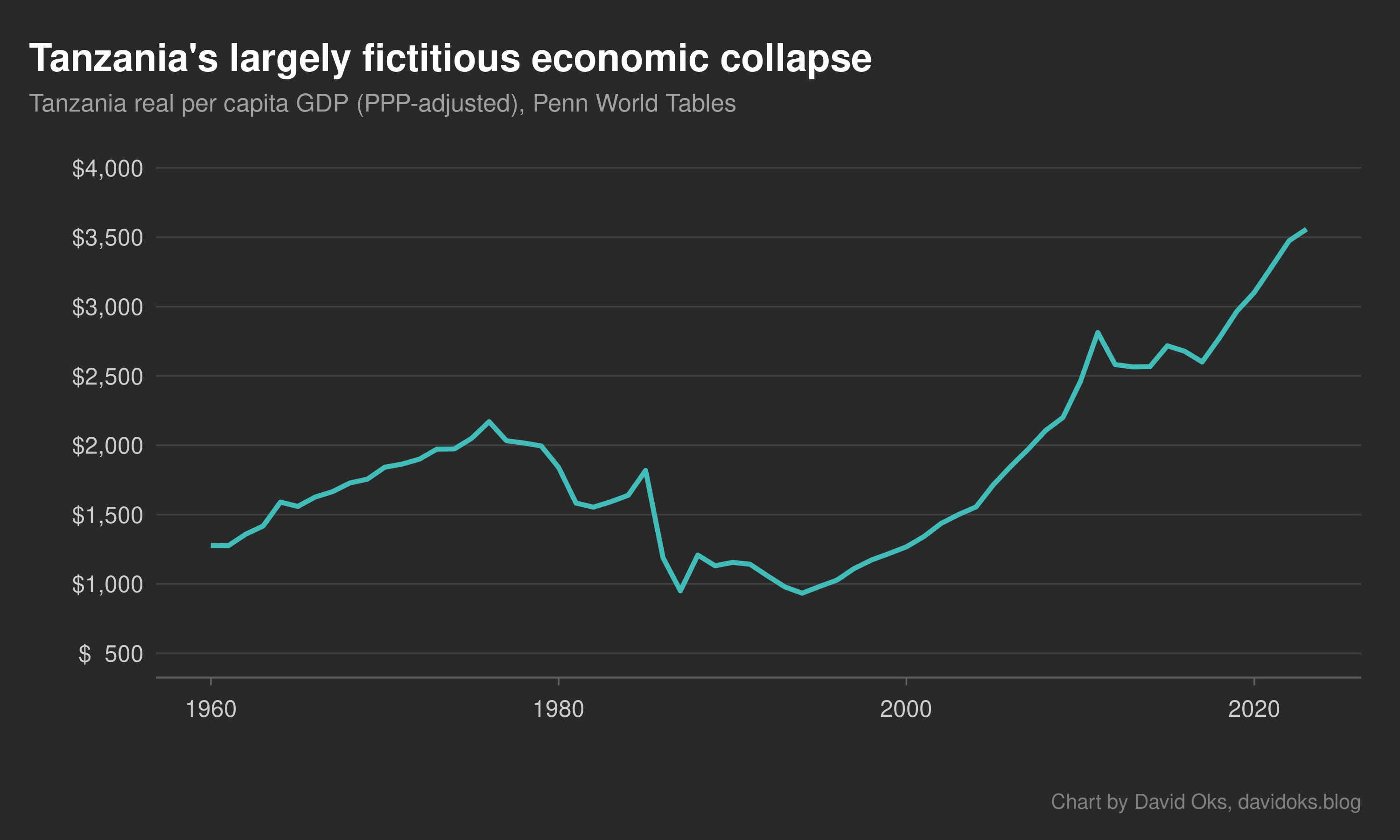
And the combination of terrible measurement with bad statistical practice means that we have no real understanding of the economic history of Africa. Take, for example, the apparent economic collapse that hit Tanzania in the 1980s.
In the 1960s and ‘70s, Tanzania committed itself to the ambitious socialist developmentalism of its charismatic leader, Julius Nyerere. And in the late 1970s, as it did in so many other countries, this ambitious project of state-led development hit a wall. So Tanzania turned to the International Monetary Fund for financial support. The IMF agreed to help on the condition that Tanzania liberalized its economy. And so the state retreated from economic life, and huge portions of the economy that it had previously monopolized—most importantly, the marketing of agricultural produce—were taken over by informal entrepreneurs.
But during this period, Tanzania’s GDP numbers were calculated using a 1976 base year, and that base year had given massive weight to the government sector and very little to the informal sector. So the decline of the overweighted government sector and the rise of the underweighted informal sector gave the appearance of a massive decline in GDP. In reality, all that had happened was the state giving up market share to the informal economy. But in the GDP figures, it looked like one of the largest economic collapses in history.
It wasn’t until 1997 that Tanzania’s government updated its base year to 1992 and announced that GDP had been underestimated by anywhere from 30 to 200 percent. But reconciling the two data series proved extremely difficult. The World Bank opted simply not to cut the Gordian knot and not publish numbers before 1987.
But the Penn World Tables, widely used by economists studying growth rates, tried to produce a cohesive picture. And they failed disastrously. “Somehow, when the Penn World Tables tried to reconcile the conflicting series, a large negative annual percentage growth rate (-33 percent) was recorded for the year 1988.” And so if you look at the Penn World Tables series for Tanzania’s GDP, you’re presented with statistics showing a massive economic collapse, on the scale of the Great Depression in the United States. But that economic collapse never actually happened.
What should we do about fake GDP numbers?
Where does that leave us?
Jerven focuses on Africa, and that focus makes sense: of the world’s 30 poorest countries, 25 are in sub-Saharan Africa. But we have no reason to think that the problems of GDP are limited to African countries. Lower-middle-income countries with relatively capable governments, like India or Egypt, will typically do a reasonably good job with calculating GDP. (Though there are prominent complaints about the credibility of Indian GDP numbers, in part due to base year issues.) But the poorer the country, and the weaker its government, the more dubious GDP numbers will be.
Take Afghanistan. Afghanistan is another very poor country with a weak state: and again we find that the GDP figures that are published on its half are little more than vague guesses. This was already the case in the 2000s and 2010s, during the American occupation, and it was worsened by the fact that GDP calculations didn’t include the opium trade—the country’s only truly dynamic sector. And the problem only got worse when the Taliban took over in 2021. The Taliban doesn’t produce economic data. So the World Bank resorted to simply surveying a few dozen Afghan businesses and asking them how things were going, and checking their responses against customs data. But there’s no reason to think that those numbers are an accurate representation of reality. When researchers tried to estimate Afghan GDP using satellite data, they reached a totally different result.
But we can’t verify either number against anything like ground truth. Satellite data is probably better than survey data or bad government data, because it doesn’t have all the biases and limitations that emerge whenever humans are involved. But for the poorest countries, satellites can only do so much. The relationship between night lights and GDP breaks down in countries dominated by subsistence agriculture, because subsistence farming doesn’t use much light; in fact, for countries where agriculture accounts for more than 40 percent of GDP, there is no statistically significant relationship between night lights and economic output. What light that does get produced—in small villages, for instance—is generally too dim to get captured by current satellites. Areas in Tanzania with population densities below 140 persons per square kilometer, home to about 70 percent of the population, register essentially no night light at all. So, at least at the moment, satellites can’t rescue us from the poverty of poor-country statistics.
But satellites are better than nothing. And more and better satellite data would definitely be useful. At the moment, though, we are bottlenecked by bad statistical capacity in poor countries. It would be nice if we could simply solve this by deciding to improve statistical capacity in poor countries. But statistical capacity in poor countries is bad because state capacity in poor countries is bad. And that’s a very hard problem to solve.
In the meantime, we might do some good by tweaking incentives for poor countries to make their statistical bodies better at the margins (that’s Jerven’s suggestion), or we might start publishing GDP numbers with margins of error (that’s Oliver Kim’s suggestion), or we might just invest in more and better satellites (that’s my suggestion). But we also need to accept that the economic numbers that we have for the poorest countries—the ones that we use to make inferences about which policies are working and which are not—are just really, really bad.
You shouldn’t read this as me attacking GDP. I like GDP. I think GDP, or something that correlates extremely strongly with GDP, is inevitable in a world governed by complex systems. And numbers that aren’t perfect representations of reality are better than no numbers at all. Just because you can’t understand the world perfectly doesn’t mean you shouldn’t try. The map isn’t the territory. But the map is nice to have.
But we also need to be conscious of the fact that sometimes the map has simply nothing to do with the territory. Maybe it’s a map that was made by someone who’s never actually been to the territory.
In my recent post on population numbers, I concluded by saying that we need to be humble about how much we know about the world. That is true for population numbers; but it’s even more true for economic statistics. If population numbers are sometimes vague estimates, then GDP numbers are often just pure confabulations. We just know much, much less than we like to think.
"But the World Bank and institutions like it can’t simply stop publishing GDP data."
Of course they can simply stop publishing GDP data. They prefer publishing BS rather than admit they don't know for purely political and face-saving reasons, which are of course MUCH more important than helping these countries improve
Lies, damned lies, and worst of all, statistics.